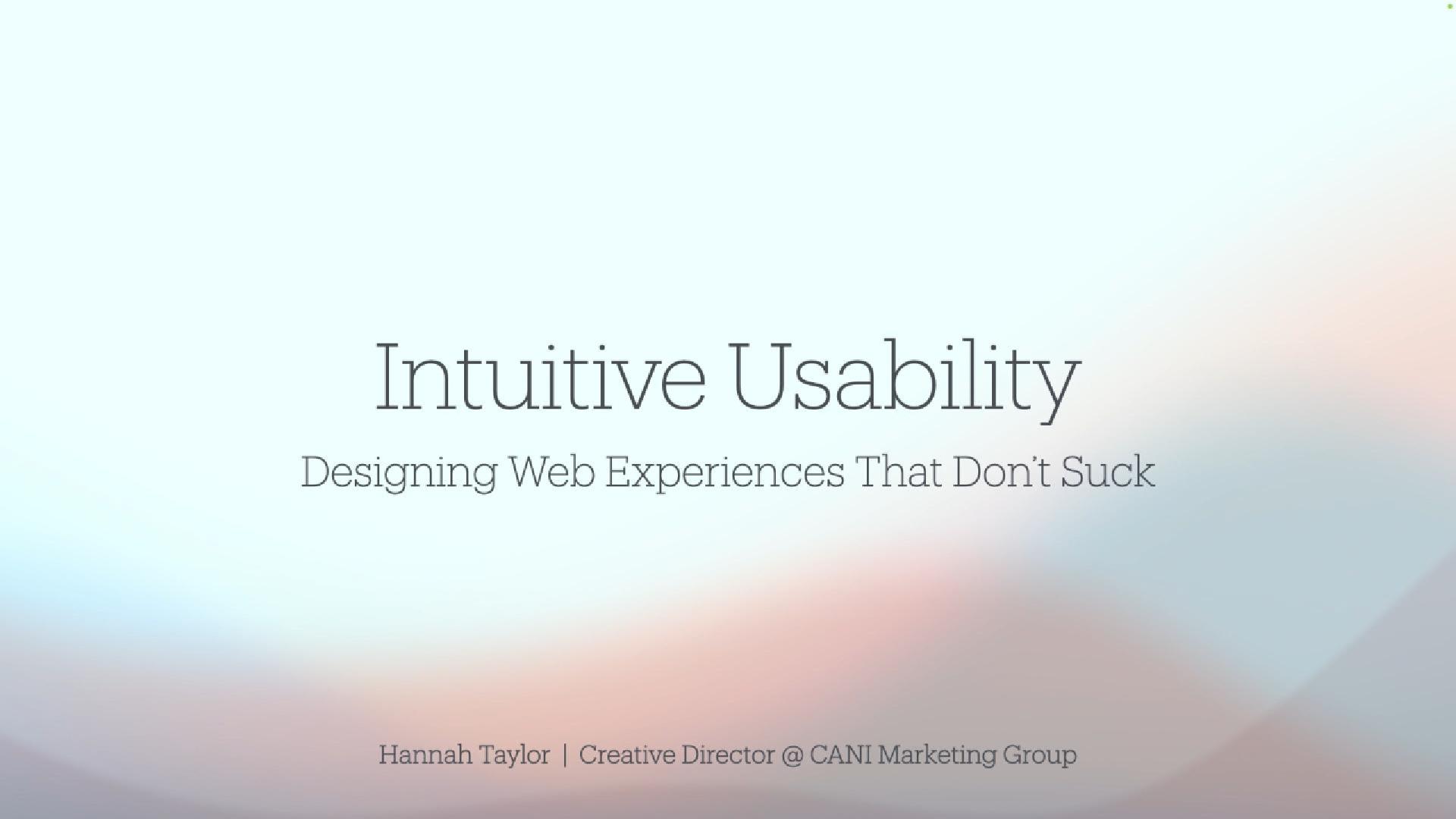
At WordCamp Buffalo 2024, our very own Creative Director, Hannah Taylor, took the stage to deliver a compelling talk on “Designing At WordCamp Buffalo 2024, our Creative Director, Hannah Taylor, shared her expertise on “Designing Web Experiences That Don’t Suck.” Her talk focused on the key principles of intuitive usability and the importance of crafting web experiences that are simple, familiar, and user-friendly. Below, we’ve recapped some of the standout moments from her session and shared practical takeaways for anyone involved in web design or development.
1. Familiarity Over Flash: Why Simplicity Wins
Hannah stressed that predictable design patterns are crucial for a smooth user experience. While it’s tempting to get creative, users want websites that feel familiar and intuitive. They don’t want to waste time figuring out how to navigate a site.
- Hannah’s Insight: “Sticking to standard usability patterns reduces cognitive load and enhances the user experience.”
- Our Takeaway: Keep it simple. Don’t confuse your visitors with overly complicated layouts or unexpected features.
2. Harnessing Intuition as a Usability Superpower
Hannah highlighted that designers have an intuitive sense of what works and what doesn’t, but often overlook these feelings. Acting on these instincts is key to improving the user experience.
- Key Example: Non-clickable headers styled like buttons can frustrate users. Intuition tells us this is wrong—so fix it.
- Our Takeaway: Trust your gut, but more importantly, act on it. Don’t ignore moments of confusion—use them to guide improvements.
3. Avoid Common Usability Pitfalls
Hannah provided specific examples of usability issues that frequently cause frustration:
- Scrolljacking: Forcing users to scroll in a way that feels unnatural creates friction.
- Hidden CTAs: Calls-to-action should always be visible and obvious, especially in eCommerce.
- Non-clickable visual cues: Users expect certain elements (like plus icons or hover effects) to be interactive. When they aren’t, it leads to confusion.
- Hannah’s Insight: “Just because you can add a fancy feature doesn’t mean you should. Keep the user experience simple and intuitive.”
- Our Takeaway: Usability always comes first. Keep the experience seamless and avoid overcomplicating your design.
4. The Cost of Poor Usability
One of the most striking points Hannah made was about the real-world cost of bad usability. Every moment of frustration or confusion is a potential lost sale. Small usability issues that go unresolved can drive visitors away.
- Hannah’s Insight: “All those little moments of friction that you might overlook? They’re blockades for your users. And if they don’t convert, they’ll leave for a competitor’s site.”
- Our Takeaway: Don’t underestimate the impact of minor usability issues. They can add up and hurt your conversions. Fix them before they become bigger problems.
5. How Do You Know When You’ve Nailed It?
Hannah’s advice on knowing when your site is working well? Test everything. Don’t assume users will figure it out. If something isn’t clear, it needs to be fixed.
- Hannah’s Insight: “Test your website like you’re the visitor. If anything bugs you about the experience, don’t ignore it. Fix it.”
- Our Takeaway: Usability testing isn’t a one-time task. Continuously test your site on multiple platforms and devices to identify pain points and resolve them.
Watch the Full Talk
You can watch Hannah’s full presentation from WordCamp Buffalo 2024 right here:
View the Slides
For more details on the examples and points discussed, you can view Hannah’s presentation slides here.
Hannah’s talk was a great reminder that intuitive design isn’t about flashy features—it’s about creating an experience that feels effortless. Simple, user-friendly design enhances the user experience and drives better results.
For more insights on how we at CANI Marketing Group create user-friendly, high-converting websites, checkout CANI Marketing Group’s Web Design Services.
